Even though I’ve known about non-photo blue pencils for some time, I’ve only been using them to sketch for about four or five years since I discovered the artwork of John Muir Laws—and became more inspired after attending the 2016 GNSI Conference in Santa Cruz where John was a presenter.
Even though I’ve known about non-photo blue pencils for some time, I’ve only been using them to sketch for about four or five years since I discovered the artwork of John Muir Laws—and became more inspired after attending the 2016 GNSI Conference in Santa Cruz where John was a presenter. I really like the freedom to work rough and loose without later worrying about the blue lines competing with the final sketch. This allows me to keep my final sketch and rough sketches together, i.e., in my sketchbook instead of using a separate sheet of paper (and light box/pad) to create the final piece. You can then digitally remove the blue sketch with Photoshop as I learned from Ikumi Kayama’s excellent demo on her YouTube channel. [The video is called Photoshop Tutorial for Scientific Illustrators: Separating Out Non-Photo Blue from Graphite. Here's the link: www.youtube.com/ watch?v=nzuonxGd_Hc.]
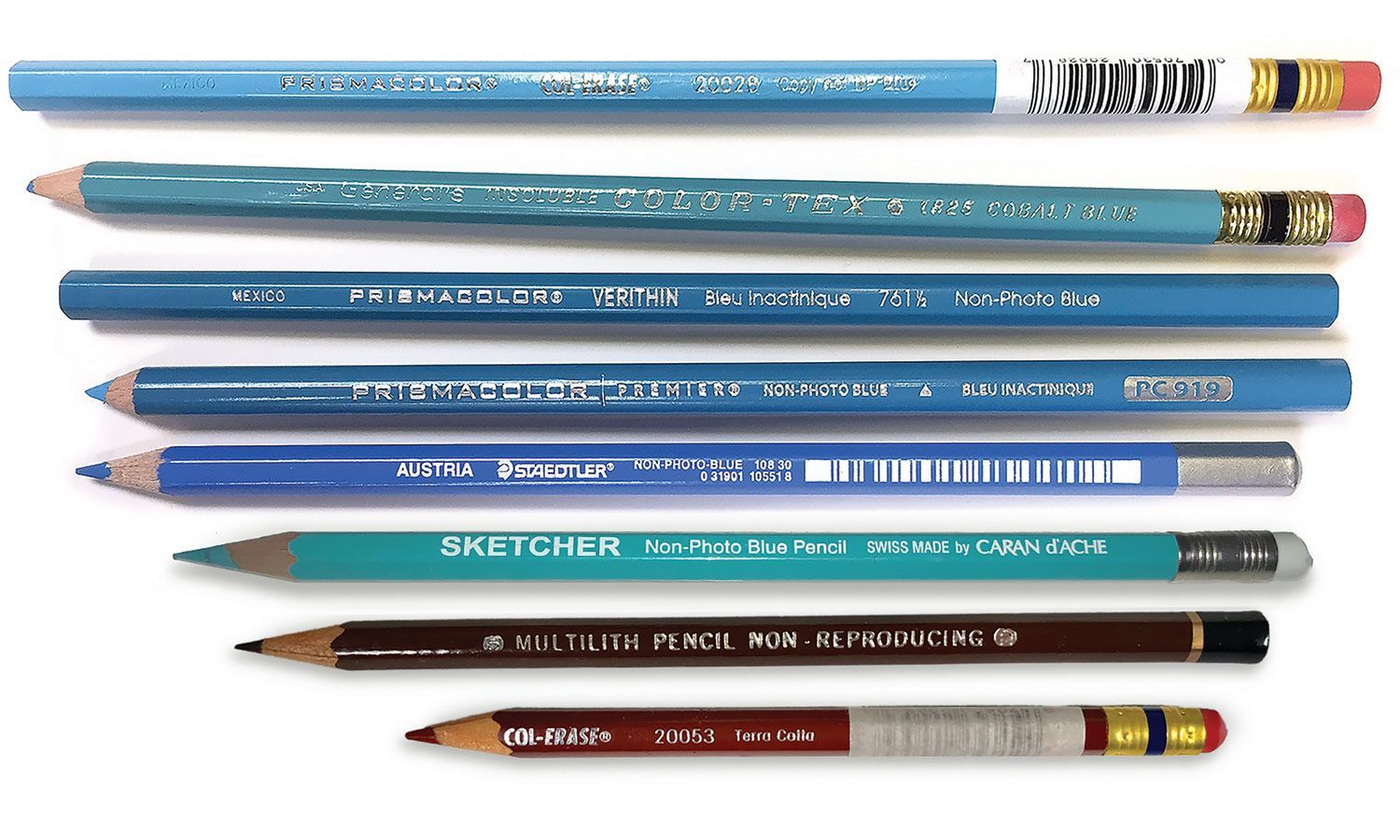
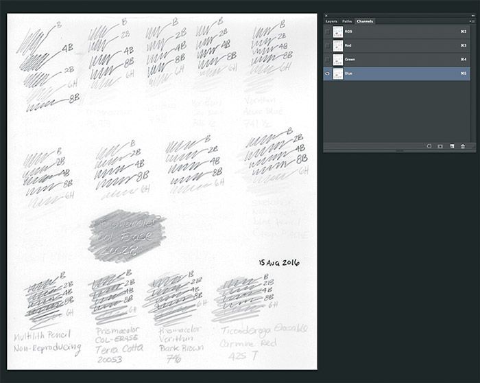
Figure 1: Different types of non-photo pencils. (Top to bottom) Prismacolor Col-Erase 20028 in Copy not NP Blue, General's Insoluable Color-Tex 1825 in Cobalt Blue, Prismacolor Verithin Bleu Inactinque 761 1/2 Non-Photo Blue, Prismacolor Premier Non- Photo Bleu Inactinique, Austria Staedtler Non-Photo Blue 108 30, Sketcher Non-Photo Blue Pencil by Caran d'Ache, Multilith Pencil Non-Reproducing, and Prismacolor Col-Erase 20053 in Terra Cotta.
Not all non-photo pencils are the same (Fig. 1). I tried a bunch and here’s what I discovered. I started with the Prismacolor Col-Erase 20028 because that’s the one John Muir Laws uses. I found the marks it left on the paper were too light for my liking. I also didn’t like the tactile feel of pencil to paper because of the combination of somewhat waxy and hard (~H–HB) lead. When using gray-toned paper, I found the lines were almost impossible to see. But if you want your final sketch to clearly shine through your rough construction lines then you’ll probably like this pencil (Fig. 2).
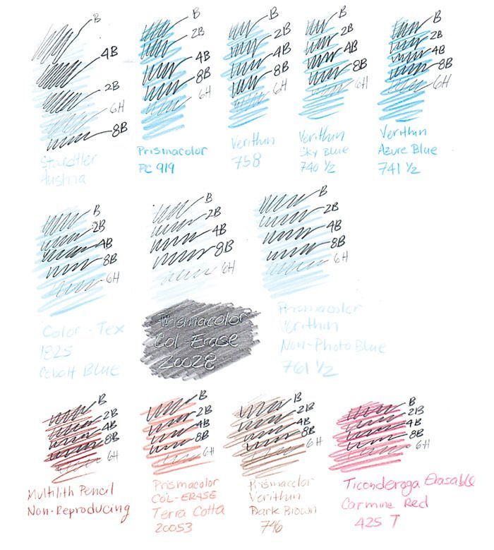
Figure 2: (a) Comparing non-photo pencil lines with overlaying graphite pencil marks of various hardnesses.
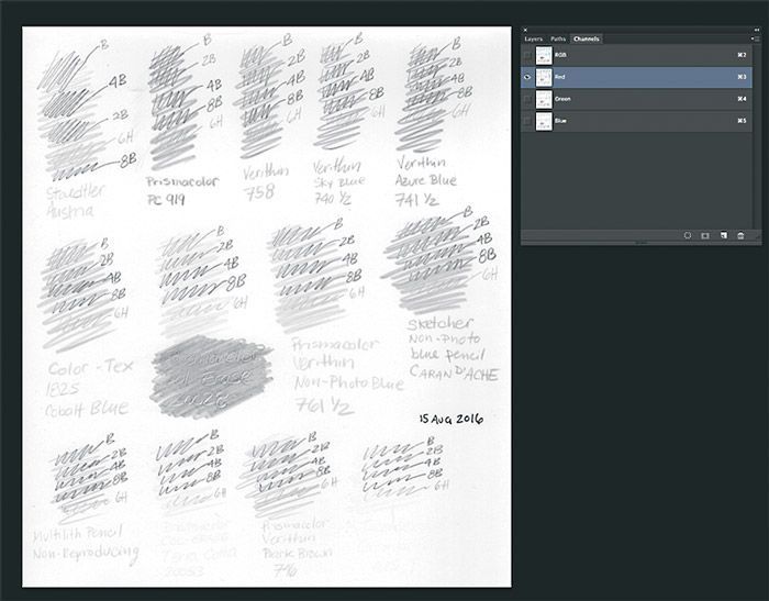
(b) Non-photo pencil test sheet (top) with blue channel selected, i.e., blue lines filtered out. (c) Non-photo pencil test sheet (bottom) with red channel selected, i.e., red lines filtered out.
On the opposite end, I really enjoyed the tactile feel of the Sketcher and Staedtler because of their soft leads (~B–2B hardness range) and smooth application on white and toned paper. The trade-off is a more prominent blue under drawing. This is purely aesthetic because the non-photo blue can be removed digitally (Figure 2a and b). If you prefer a warm under drawing you have the option using non- photo red/brown pencils too. I’ve only experimented with a couple but the results are the same. Use the red channel in Photoshop to remove or filter out your red sketch (Fig. 2a and c). Although I like using several non-photo pencils, the one I liked the most is the General’s Color-Tex because of its combination of lead hardness (~HB–B), erasability, and intensity of blue.
All the non-photo pencils I tested performed well in Photoshop when their color was filtered out. The only difference would be your preference of the look and the feel of the pencil on the paper you are using. Try a non-photo pencil and have some fun!
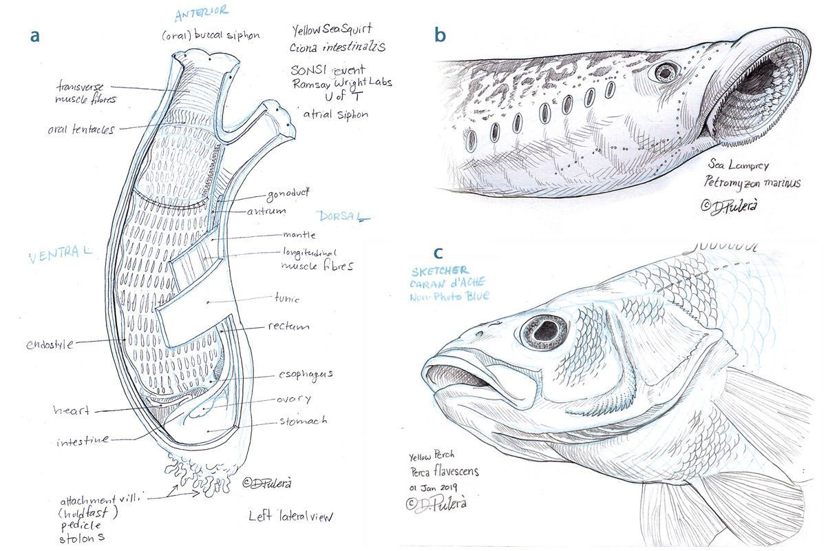
Study of a sea squirt/ tunicate (Ciona intestinalis). Austria Staedtler Non-Photo Blue 108 30 and graphite pencil. ©Dino Pulerà
Study of the head of the sea lamprey (Petromyzon marinus). Austria Staedtler Non-Photo Blue 108 30 and graphite pencil. ©Dino Pulerà
Study of the head of a Yellow Perch (Perca flavescens). Sketcher Caran d’Ache Non-Photo Blue and graphite pencil. ©Dino Pulerà
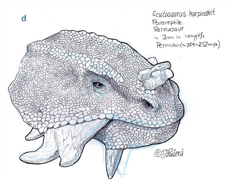
Study of the head of Scutosaurus. General’s Color-Tex 1825 Cobalt Blue and graphite pencil. ©Dino Pulerà
About the Author
Dino Pulerà
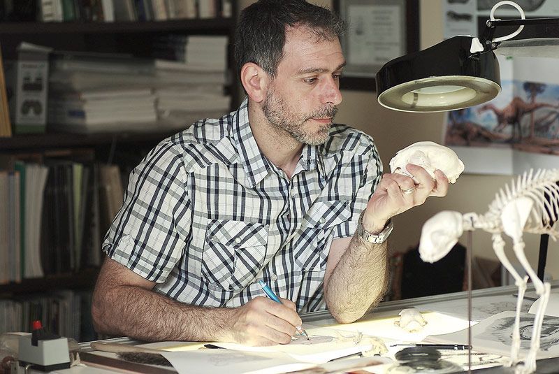
Dino was born and raised in Toronto, Canada. Growing up he had a passion for art, science, and nature. He pursued his undergraduate and graduate studies at the University of Toronto, receiving a BS in Zoology and an MS in Biomedical Communications. Dino is a medical illustrator by day and a natural science illustrator by night specializing in animal anatomy and paleontology.
www.dinopulera.com
This open-access article appears in the Journal of Natural Science Illustrators, Vol. 51, No. 1, 2019.