Though scratchboard as a professional art began in the 1800s as black-and-white illustration reproduced for books and newspapers, many people have since experienced scratchboard in a grade school art class with black ink over crayons and a sharp tool scratching away differing amounts of ink, revealing portions of the colorful layer beneath. For children it was a memorable work of wonder!
Today’s scratchboard artists follow the same concepts, starting with a foundation board of Masonite® covered with kaolin China white clay with black India ink atop the clay. They then scratch the surface using an abrasive tool (often an X-Acto® knife blade) to remove the top ink layer in varying degrees with varying hand pressure—with light scratching exposing a bit of white, making a charcoal gray, to heavier scratching (or more layers of light scratching) exposing pure white clay. Because these steps take away rather than add to the prepared base, scratchboard is called a subtractive process. Today many scratchboard works are regarded as fine art, appearing in galleries, museums, exhibitions, and are sought by private and corporate collectors.
My scratchboard introduction was not as a child in grade school, but as an adult with master scratchboard artist Trudy Nicholson, a Guild of Natural Science Illustrators’ colleague who worked for the Smithsonian Institution. Decades later when the COVID-19 pandemic hit, I used Trudy’s and other artists’ works as inspiration to teach myself scratchboard. Incredibly, it was a seamless transition. The stroke I use as a colored pencil artist—a stroke I call the “airplane stroke” because it approaches the paper gently connecting with the surface, then gently lifts from the paper (a pilot’s "touch-and-go")—is the exact stroke I use with scratchboard. I literally replaced the colored pencil usually found in my hand with the X-Acto knife and proceeded as if drawing, with the blade gently scratching the premanufactured, black ink–covered scratchboard panel, removing the ink, revealing the gray, lighter grays, and white beneath.
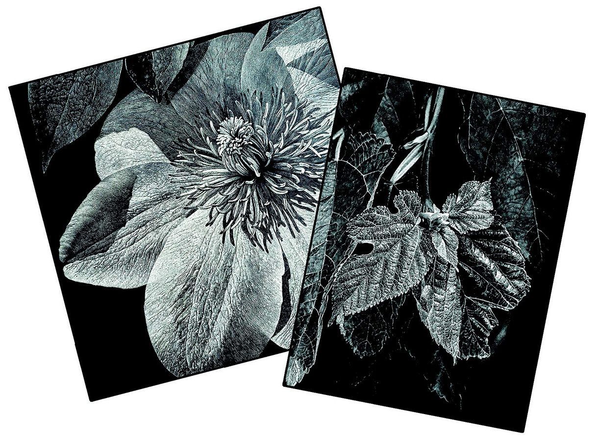
Figure 1: A clematis bloom and mulberry leaves distinctly exhibit the full value range from black (ink) to white (clay) with many grays between—a good introduction for those who have little experience with scratchboard. The mulberry leaf scratchboard won the Gold Award/Signature in 2023 at Tucson’s Arizona Sonora Desert Museum conference. All artwork and photos ©Rhonda Nass unless otherwise noted.
Because scratchboard is not (yet!) a common medium for botanical artists, I hope to encourage you to try it by modeling the step-by-step process I used to complete Beauty Amidst Damage (Fig. 9).
Step 1: Collect Supplies
My go-to scratchboard supplies (Fig. 2) include the following items:
- A “sanity window,” a small window cut from paper
- Two pre-inked scratchboard panels (I prefer 6” × 6,” but there are many sizes available)
- X-Acto knife with extra blade (I use #11 style)
- Red and black Pigma Micron® pens
- Graphite (HB) pencil
- Feather or brush to gently brush away scratched ink residuals
- A bit of 150-grade sandpaper for woodworking
- A rag to wipe the sandpaper-sharpened blade
- Masking tape
- Translucent tracing paper (I use Canson Tracing®)
- Transfer paper, either manufactured (Saral®) or handmade (Canson Tracing plus soft HB graphite, or translucent vellum plus white colored pencil, applied in one direction on one side)
- Lascaux® brand finishing spray (archival varnish with UV protection)
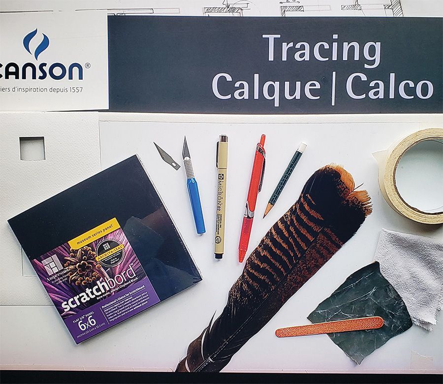
Figure 2: Scratchboard supplies. A “sanity window” (left middle) is a small window cut from paper which allows one to see an intentionally limited area of the reference photo, building confidence to proceed for even complex textures.
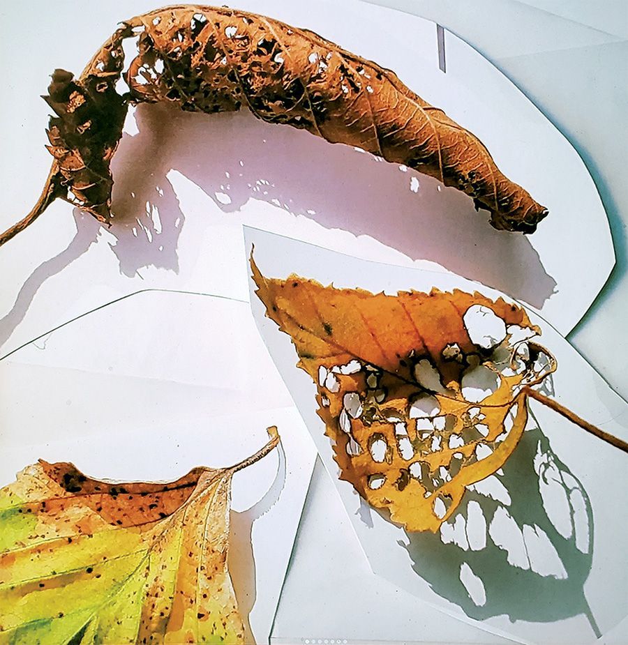
Figure 3: I shoot 30 or so photographs of my chosen subject, then enter them in Photoshop and alter lighting to my taste, translate color to grayscale (if graphite or scratchboard), then cut and paste what I want to include in a photo composite. The composite will be the reference guiding my drawing.
Step 2: Determine Concept/ Message/Subject Choice
Sometimes the allure of a subject inspires a work, e.g., the holes and resultant shadows created from dried, insect-eaten leaves. Or sometimes the birth of an artwork begins with an idea, e.g., “beauty despite brokenness,” and we choose a subject to communicate the concept.
Step 3: Create Reference/Source Material
Painting live for a black-and-white scratchboard has the disadvantage of requiring mental translation from color to value—a very challenging and usually inaccurate task. By using my own photography I can arrange dramatic lighting, change color to grayscale via computer/phone/photo studio, and cut and paste
to create an easily readable photo composite (Fig. 3).
Step 4: Design Composition
My usual composition go-to is the “rule of thirds,” placing the focal point at any intersection of lines created when the height and width of the format are divided in equal thirds. But for this layout I felt there was not one clear focal point, so I adjusted my approach.
Step 5: Trace and Transfer the Drawing
You may prefer drawing directly from your source material to paper. I most often trace outlines from my designed photo composite using a graphite pencil on tracing paper. Then with the inked panel down first, the transfer paper with graphite side down atop the panel, and the tracing paper with outlines atop that, I retrace graphite lines with a red Pigma Micron pen. If interrupted, red shows transferred lines. At times I make the transfer paper with white colored pencil on translucent vellum (Fig. 4).
Step 6: Plan for Aces
Aces are the polarized lightest light and darkest dark values of any medium. In scratchboard the ink is the darkest dark ace, so we address the white ace. By visually planning to remove the whitest white of your subject from your working palette, you typically preserve a pure white clay area later scratched at the very end of your drawing process. Despite the white background of this work, the aces principle still applies. (The concept of aces came in a class I took from Robert Bateman, conservationist and wildlife artist… best art lesson ever!)
Step 7: Create a Value-Match Guide
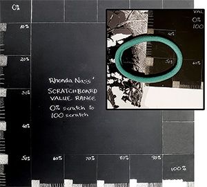
This lifelong tool will ensure accurate value transfers from photography to original art (Fig. 5).
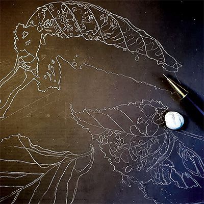
Figure 4 : I transfer my preliminary drawing to the black scratchboard using transfer paper. I made this transfer paper with white colored pencil on one side of translucent vellum.
Figure 5 : I made the scratchboard "value match guide" once and have used it repeatedly to convey an accurate value range from black to white, with shades of gray in-between. I labeled each segment of this value continuum with the percent of black removed (e.g. black = 0% to white = 100%). This is useful when placed adjacent to the photo composite, and guides and gives confidence to the artist to know how much black to remove on the scratchboard to replicate the photo values. The close-up inset shows how I placed the value-match guide atop a portion of the photo, revealing how much ink I need to scratch off to match the photo value shown.
Step 8: Start the Scratching Process
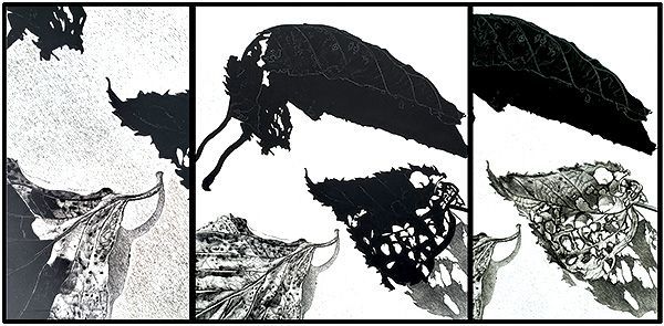
I begin scratching using the airplane stroke described earlier, working from dark to light, and determining the direction of the stroke based on the subject’s contours (Figs. 6, 7, and 8). Remember, it’s always easier to remove more ink than to correct, but adding ink with a black Pigma Micron pen to the mistakenly over-whitened areas will allow re-scratching for the corrected value.
Step 9: Scratch the Aces
About a half hour from completion, I scratch the white aces at the focal point(s), which will magnetize viewers’ eyes to the light-contrasting center of interest (Fig. 9).
Step 10: Sign the Work
On black surfaces, I add my signature using a white ink pen or gray colored pencil so it will show up well. On white surfaces I sign using black ink pen.
Step 11: Seal for Protection
I spray about six coats of Lascaux brand archival and UV protection sealant on the final work.
Step 12: Frame the Work
My framing favorites include mounting the scratchboard art with double-sided tape on a 2- to 3-inch-deep birch wood panel, or floating the scratchboard art over an unscratched scratchboard panel in a black frame. Most professional scratchboard artists do not use glass or glazing.
Other artists’ steps will vary. Colored scratchboards use brushed watercolor, dyes, or colored inks atop the scratched work, re-scratching highlights for clean whites.
More inspiration for scratchboard can be found at scratchboardsociety.org. I encourage you to try scratchboard. Enjoy!
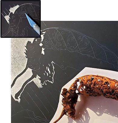
Figure 6 : Guided by the photo reference, then guidelines on scratchboard, sections at the outline of the leaf and “holes” within shadows are scratched layer by layer to reveal white clay.
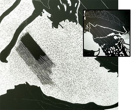
Figure 7: The white background is created by scratching layer by layer following the directional guidelines, resulting in consistency throughout the piece. This was my first piece with a white background, and you’ll see the inexperience of trying to merge the white outline of the leaves previously scratched in one direction with the later white background scratching in another direction. Always learning!
Figure 8 : This triptych shows different stages of the artwork, displaying the parallel, side-by-side, closely aligned strokes that make up the tonal bodies of values and the direction of strokes that follow the curled leaf contours.
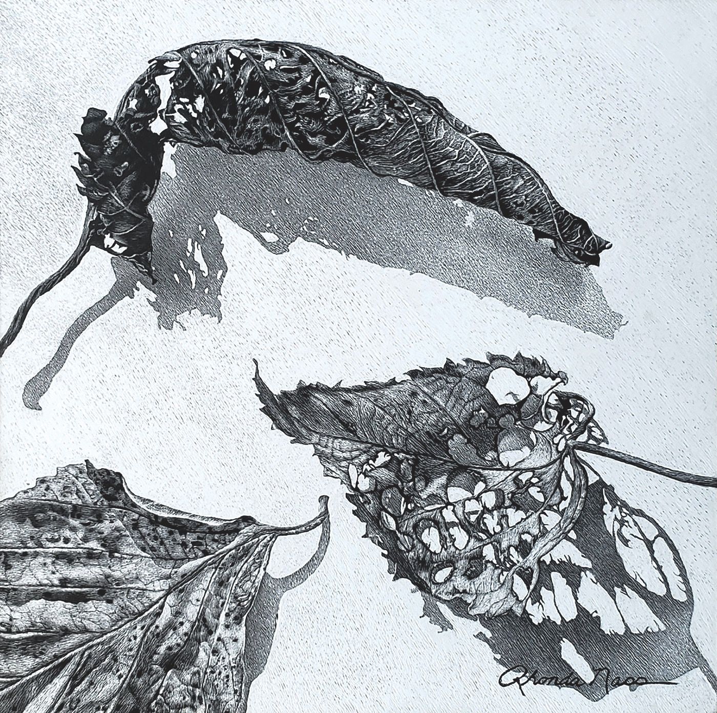
Figure 9: The intentionally reserved aces (darkest dark/black ink and lightest light/white clay) are usually added in the last half hour at the focal point to make the dramatic contrast that draws the viewer to the artist’s chosen focal point. But this piece was handled uniquely since the background was the whitest white and there were few highlights in the leaves themselves. The finished artwork, Beauty Amidst Damage, won the Gold Award/Signature from the International Society of Scratchboard Artists’ 2022 annual conference in Bradenton, Florida.
About the Artist
Rhonda Nass creates graphite, scratchboard, colored pencil, and acrylic works for private, gallery, museum, and corporate collections. Her work is published internationally.
Her drawings and paintings can be viewed at www.rnass.com/rhonda and in self-published books, Gifts from the Earth (graphite) and Scratchings of a Madwoman (colored pencil) are available via contact info on the website.
Mention "GNSI" and Gifts will be discounted to $15, Scratchings to $30.
This open-access article appears in the Journal of Natural Science Illustrators, Vol. 56, No. 1, 2024.
