Legion Paper® introduced Stonehenge Aqua Coldpress Black® in 2019, as "the world's first black 100% cotton paper sized for watercolor."
Gail's Comments
I'm not sure where or when I first saw a reference to this new paper, but I knew I had to try it out as soon as possible. Legion Paper® introduced Stonehenge Aqua Coldpress Black® in 2019, as "the world's first black 100% cotton paper sized for watercolor." It is designed primarily for metallic and iridescent paints, but I wanted to try it out with colored pencils and other media I have on hand. Camille Werther has also been experimenting with this new surface, and we decided to join forces for this review.
Our almost yearly excursions to visit my sister-in-law always include a trip to the Blick store nearby, and I was happy to see the stack of Aqua Black pads (Fig. 1a), among all the other goodies (I am lucky to drag myself out of there with minimal damage to my credit card).
The first thing I noticed about the paper is the color: it is a beautiful, deep, rich black—much richer than Canson® Mi-Tientes® or Strathmore® Artagain® black papers (Fig. 1b), both of which almost look like dark charcoal gray in comparison. The paper is quite thick and heavy (140 lb), and has a very even, toothy finish, almost like felt. It seems rougher to the touch than the textured side of Mi-Tientes.
I experimented with a variety of media (Fig. 1c). Prismacolor® pencils behaved much like they do on Mi-Teintes, and I didn't see a great deal of difference, although the color seems to snap a bit better on the Aqua Black.Predictably, the differences became more apparent with wet media. Casein and acrylics just popped off the Aqua Black. Even transparent watercolor looked more lively on this paper. I also tried watercolor ground, then transparent watercolor, which—again predictably—looked great against the black background. A quick, light sanding with 600-grit wet sandpaper smoothed out the watercolor ground even more before applying the transparent watercolor and may help with later applications.
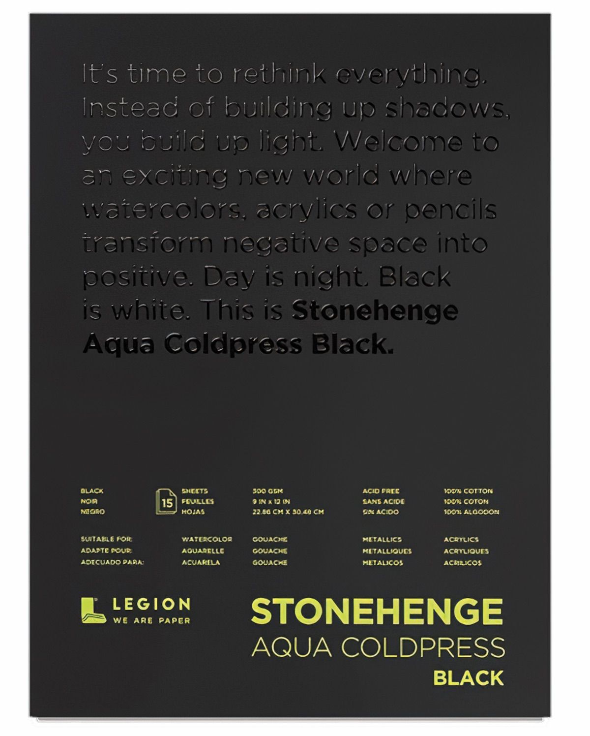
Figure 1: (a) A pad of Legion Paper Stonehenge Aqua Coldpress Black.
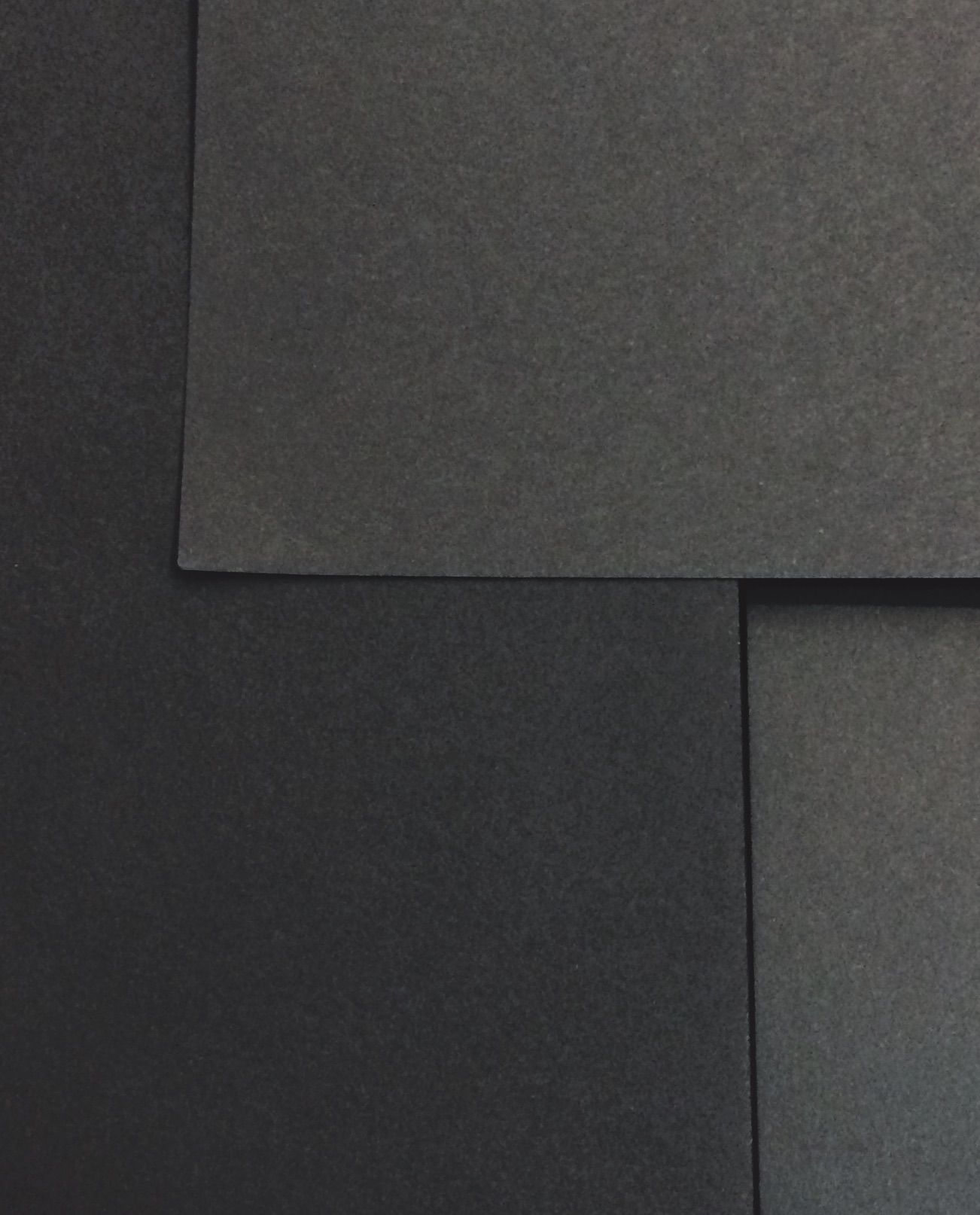
Figure 1: (b) Comparison of paper color.
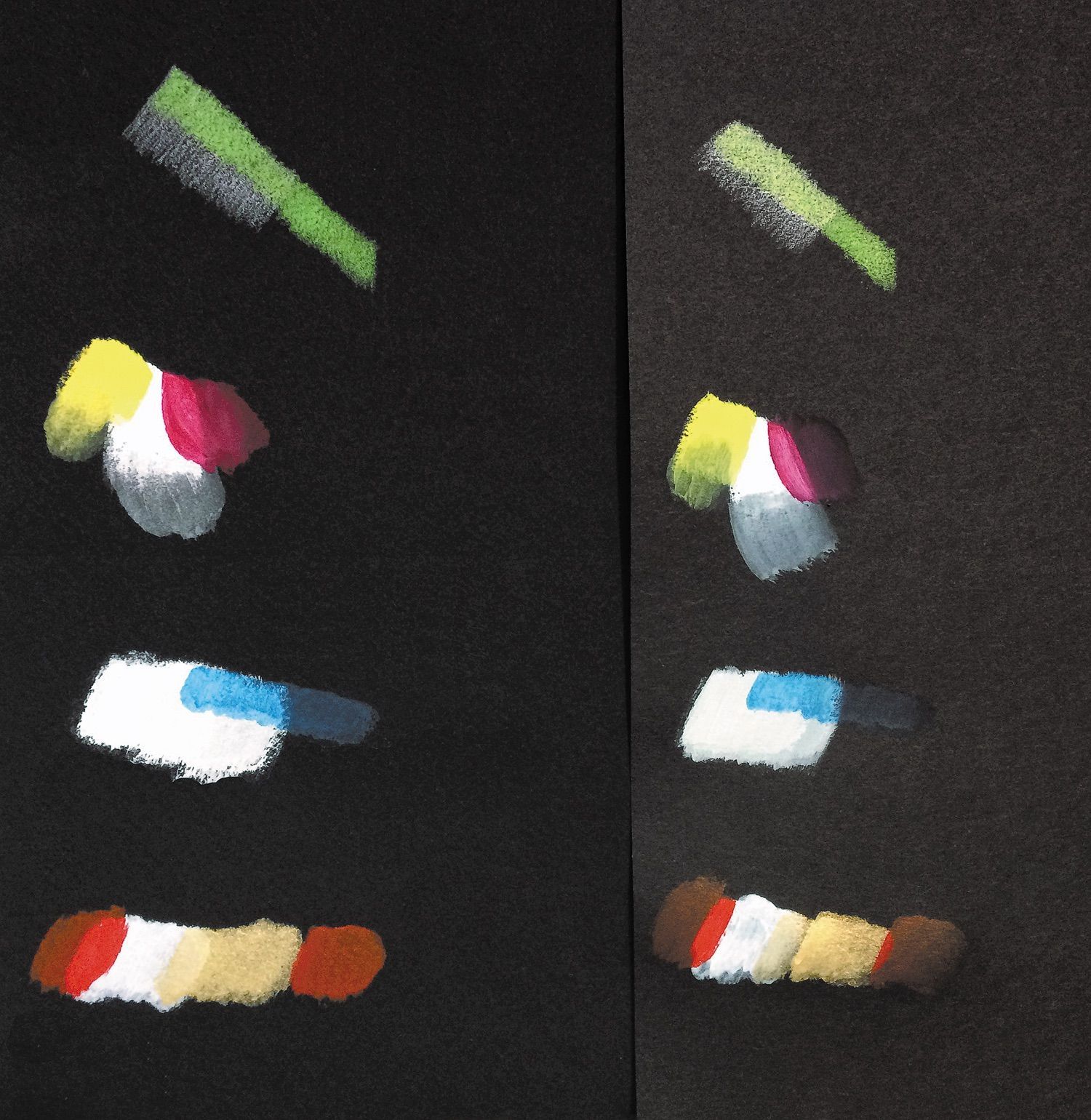
Figure 1: (c) Comparison of media on Stonehenge Aqua Coldpress Black (left) and Canson Mi-Tientes black (right). (Top to bottom) Prismacolor pencil (white base and without); Richeson casein (solid colors, overlapping color on multiple white coats, and washed colors directly on the paper); Daniel Smith transparent watercolor (directly on paper and over two coats of Daniel Smith watercolor ground); Liquitex acrylics (single coats of red, double coats of white and metallic gold).
I was surprised at how well regular gouache held up (Fig. 2); the color was strong and clean, without any ground or white background added. But again, application was more by building up color than smooth brushing.
All of the wet media I tried did apply smoothly without the streaking evident on Mi-Tientes, which is more of a dry media substrate.
My biggest issue with this stock is that it's difficult to achieve fine detail due to the fuzzy surface. With a LOT of patience and work, you can apply solid areas of color, but soft brushing doesn't work and achieving fine details with a stroke of the brush is a challenge. It seems better suited to an impasto technique, where you can build up color.
Still, with planning and patience, and for particular images and styles, Aqua Black could be a welcome addition to your substrate arsenal.
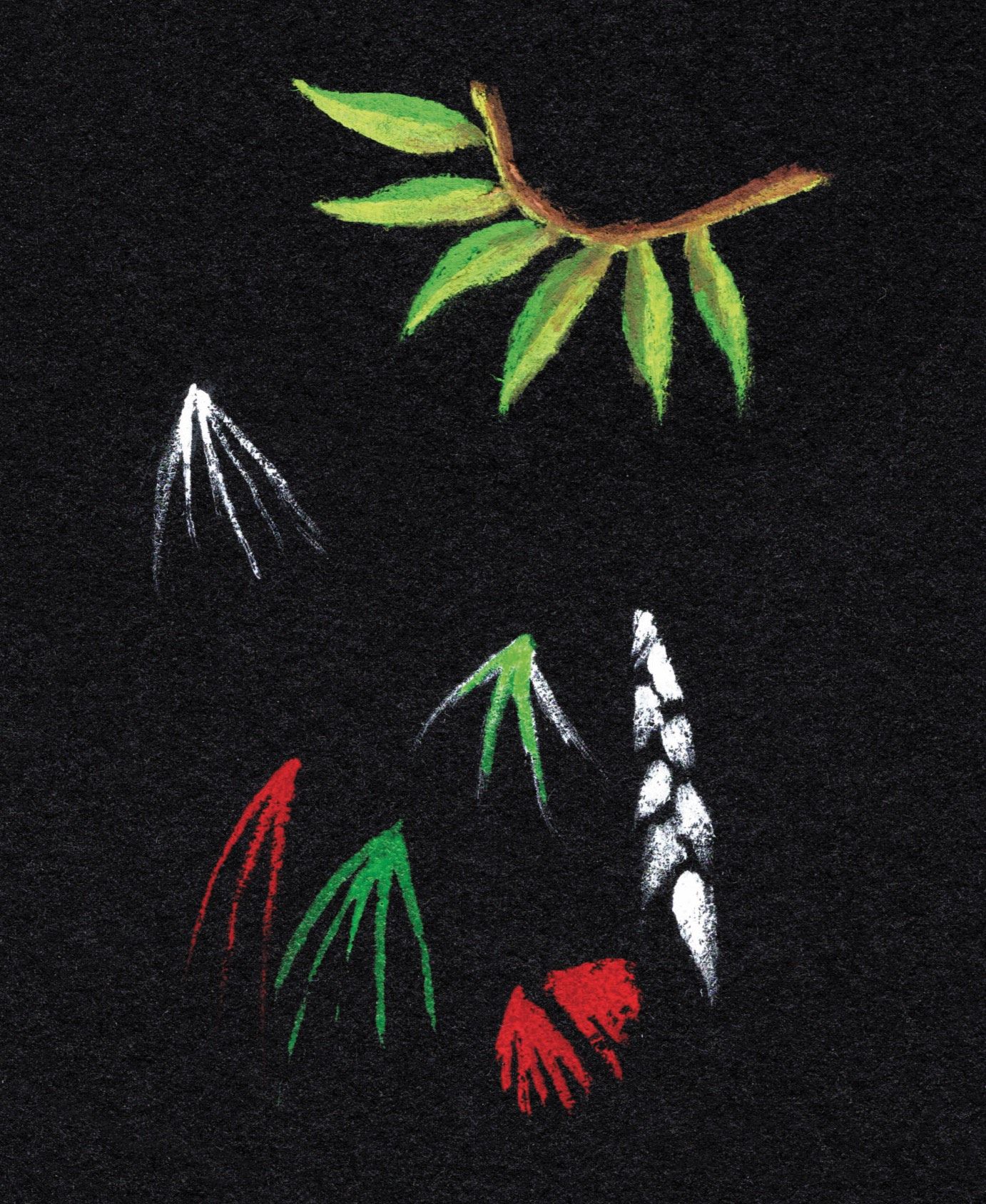
Figure 2. Acryla® white gouache and Winsor & Newton® Designers' Gouache doodles. The Acryla® is the white leafy spray at the lower right, the rest are Windsor & Newton®. The color pops beautifully but you can see the fuzzy edges. Fine details are difficult to achieve.
CAMILLE'S COMMENTS
I have been using Stonehenge Aqua Hotpress for my botanical colored pencil work and enjoy using the paper. I also use it for acrylic gouache work. Recently, I came across a little (2.5” × 3.75”) block of Stonehenge Aqua Coldpress Black. I purchased it as an inexpensive way to test the paper for dramatic botanicals.
This paper has a cold-press surface and is very soft, so it is best reserved for water media. I found that aggressive erasing and use of hard colored pencils can mar the surface. However, I was able to use the softest brands of colored pencils to achieve a loose botanical cone sketch. The surface accepted multiple layers and worked up very quickly. In the example here, I used Derwent® Coloursoft®, but I found that their Lightfast line and Caran D’Ache® Luminance® pencils gave similar results (Fig. 3a). Fine details are not easy to add in, so I would reserve this paper for when a sketchy look is wanted.
I also tried pastel pencils but was less happy with my results.
My favorite test, though, was with the Holbein® Acryla® gouache sketch I did of a conifer cone (I believe it is Larix sp.) (Fig. 3b). It responded well to the water media and there was no visible buckling. Overall, I would use this paper again for acrylic gouache or quick soft colored pencil sketches.
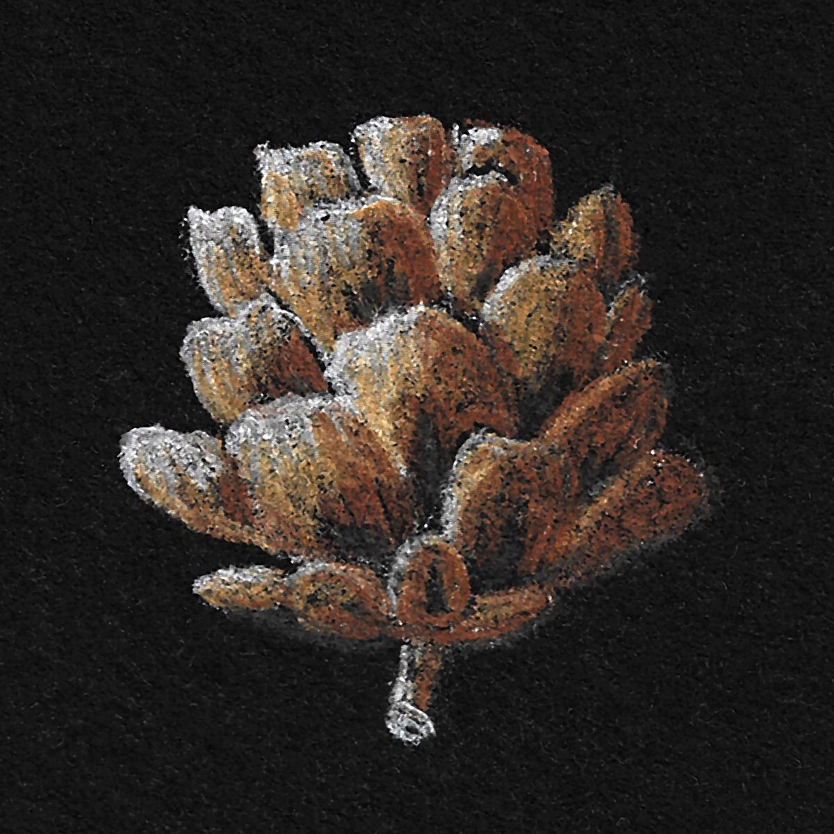
Figure 3 (a). Larch cone on Aqua Black, rendered in Coloursoft pencils.
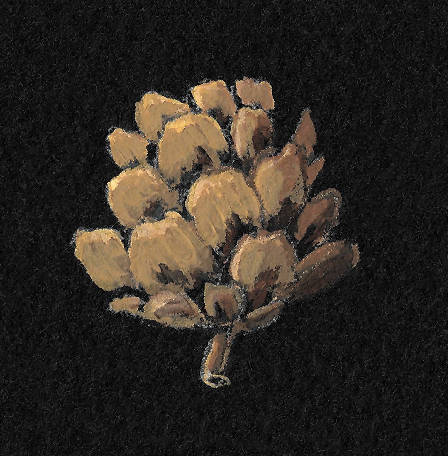
Figure 3 (b). Larch cone on Aqua Black, rendered in Coloursoft pencils.