lluminations of a 3D Alphabet
Introduction by Trudy Nicholson
Carolyn Gast, along with Elaine Hodges, worked as scientific illustrators at the Smithsonian’s National Museum of Natural History in DC. They recognized that, although there were numerous illustrators working with similar challenges, there was little connection between them. Fifty years ago she and Elaine changed the scene of separation by the founding of GNSI.
Why a Guild? This came from Carolyn’s intense interest in all things medieval. Even before her retirement in 1985, she studied the methods of creating 3-dimensional effects and tried to convince the scientists who she worked for in the Invertebrate Zoology Department to let her add them to her staff illustrations. Failing at that, she explored using them on her own time, and continued after her retirement, to create an alphabet that captures the beauty and mystery even beyond the illuminated manuscripts of the Middle Ages, as seen in her 1991 article, reprinted here.
*Reprinted from Stereo World 1991 Vol. 18(1) March/ April with permission from the National Stereoscopic Association/www.stereoworld.org
All stereo art © Carolyn B. Gast
Caroline:
For thirty-one years I was a scientific illustrator peering through a stereoscopic microscope to make two-dimensional drawings of the beautiful, highly sculptured organisms that I saw. By analyzing stereographic pairs of Scanning Electron Microscope photographs, I found the principles of placement of matching details to achieve stereoscopic results.
Being a long-time lover of Late, High Gothic (almost decadent) medieval manuscript illumination and decoration, when my scientists were underwhelmed by my ability to make stereo scientific illustrations (“But nobody has ever done that!”) I decided to dash off the letters of the alphabet, incorporating medieval elements and using stereo principles. This turns the letters into little sculptural forms; i.e., ‘A’ has an imaginary tension axis between the front and back round dots around which the rest of the letter is three dimensionally structured. Four years later, about two weeks before I finished ‘A’ and was getting used to the disappointment of seeing the reality on paper contrasting with the wonderful image of it that I had held in my head for so long, an uninvited and unexpected visitor asked sweetly, “Well, if ‘A’ took you four years, when do you think you’ll finish the whole alphabet?” The complete irrelevance and inappropriateness of the question startled me into questioning my motives and goals.
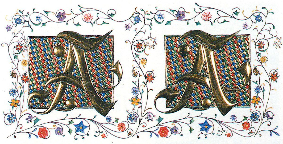
‘A’:
was completed in 1981 while the author was still a scientific illustrator with the Department of Invertebrate Zoology at the Smithsonian. The painted and drawn parts of the image are watercolors and India ink on Bristol Board.
Editor's note: You can use the technique at the end of this article to view the stereo "3D' effect in the stereo pairs. Set your browser view size to 100% (or whatever gets the image pairs 4 to 5 inches wide.)
I found that I regarded each letter as a brand new opportunity to attempt to produce a wonderful bit of fantasy, and that I would never settle for anything less than right regardless of the time involved. ‘B’ took me 6 years, but before I stopped being a scientific illustrator in 1985 I had completed ‘All Over Alphabet’ just in case anyone asked that particular question again.
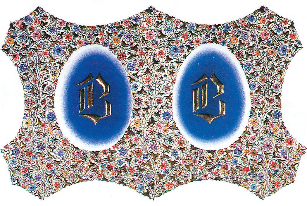
‘B’: While overall widths of the originals vary, most of the image separations are spaced for free-viewing [in the original article], with the central frame elements shared when the halves are fused. © 1982
I have exhibited them in my retrospective exhibition at the Smithsonian’s Museum of Natural History, at Northern Virginia Community College’s Tyler Gallery and at the Cosmos Club in Washington, D.C. Eventually I plan to have a portfolio of quality reproductions made to accompany future exhibitions.
‘GME’ is a personal monogram that was presented to the outgoing national president of Artists Equity, which adopted the logo (outlined by the floral design) during her tenure. I painted the ivy leaves dark to light in reverse on the two corresponding images, and when I finally viewed them stereoscopically the leaves fluttered so wildly they made me sea-sick. I calmed them down by adding identical white lines along their stems.
Once, by accident, I painted two different colors on corresponding areas and when viewed together the area glowed as if lit from behind. I’ve been trying to re-achieve this ‘luster” ever since, with only moderate success, which is why I’ve painted blue, violet and turquoise against each other in “A” ’s flowers. (Note the lower blossom on the center vine).
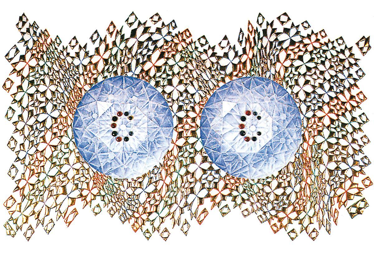
‘C’: The shaped base for the gold leaf is formed from built-up and compressed typewriter correction fluid. The C’s are real rubies and sapphires.
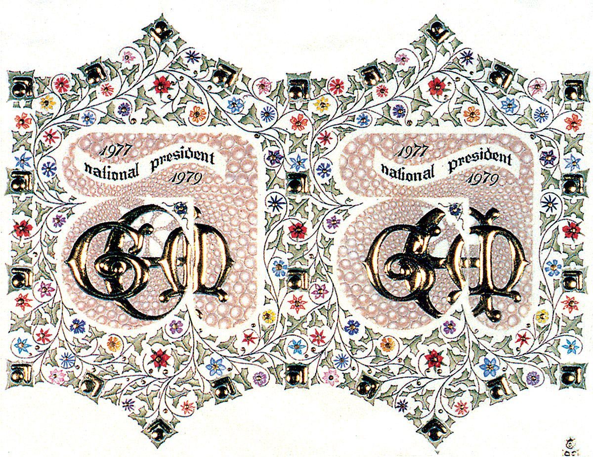
‘GME’: is an illuminated monogram made for a special presentation but it clearly shows the “depth” potential of this truly mixed media format. © 1981
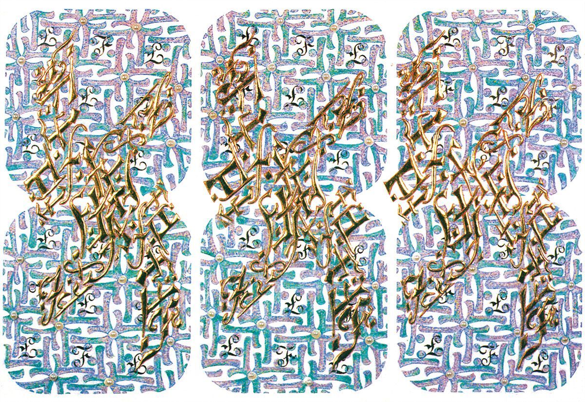
‘F’: can be fused three different ways. The pearls are (temporarily) fake but the gold is real. © 1989
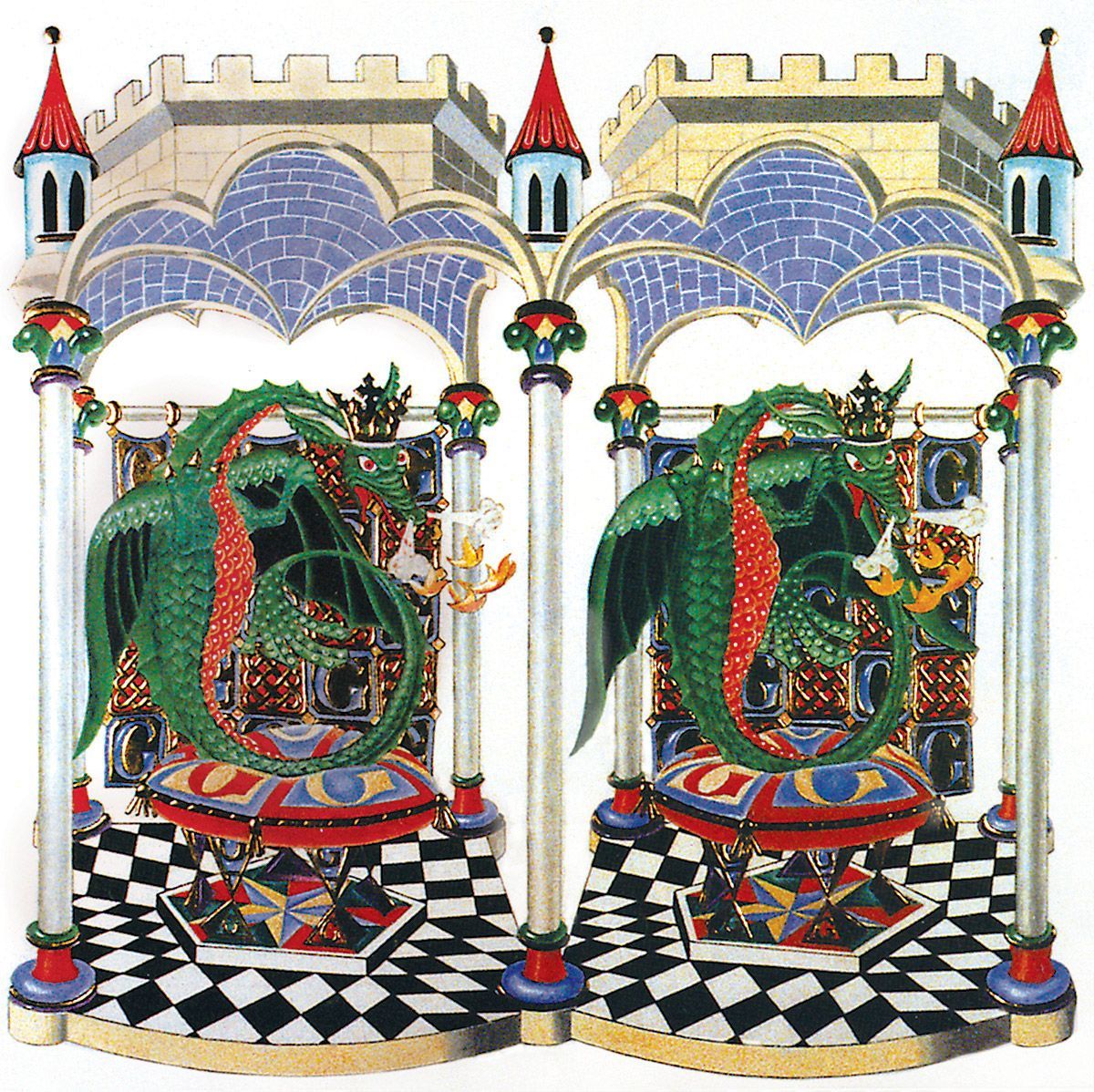
‘G’: is a more dramatic medieval fantasy which leaves only the question:
is the G for George? © 1990
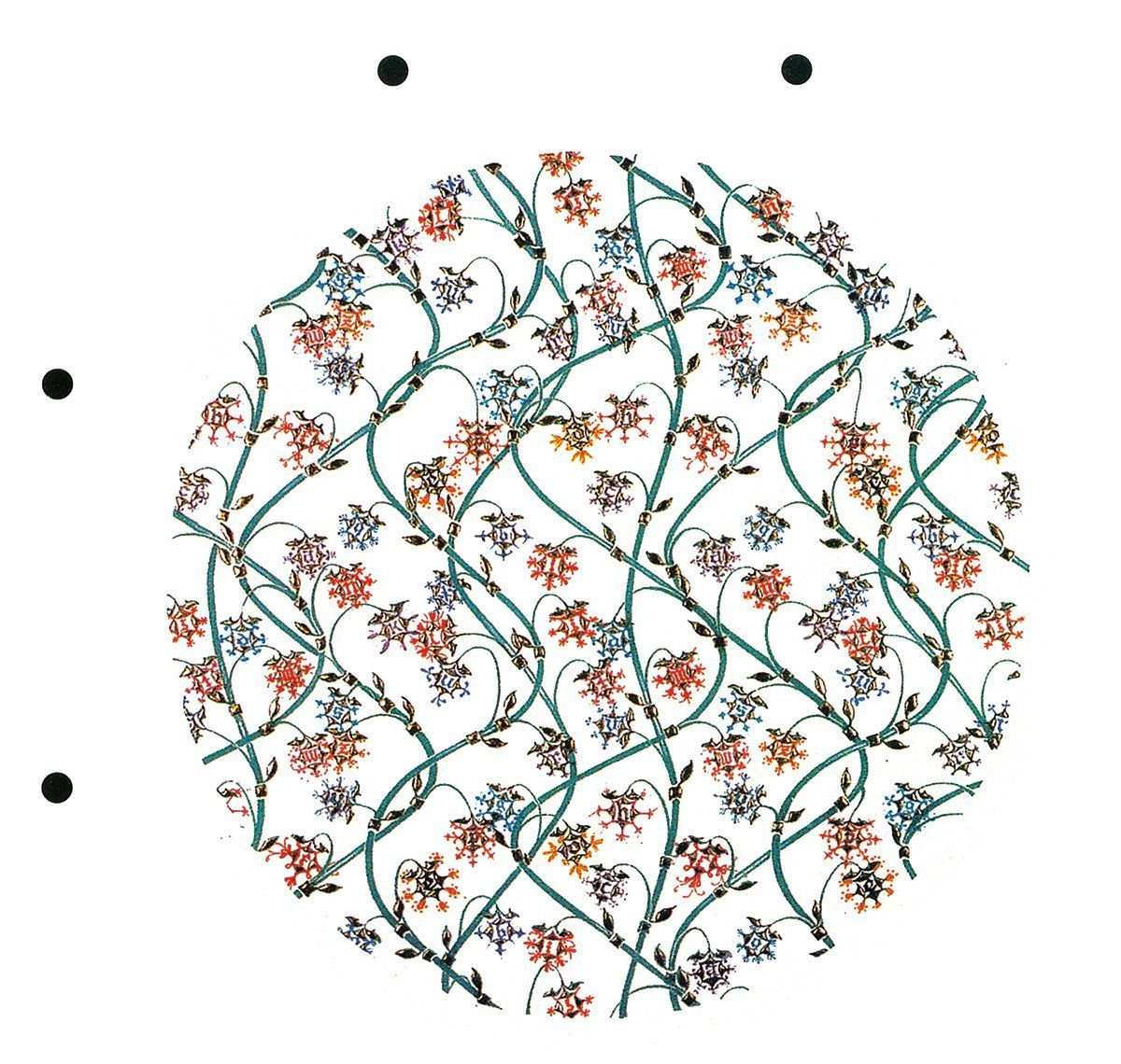
‘All Over Alphabet’: is a unique stereo image in more ways than may be evident at first. Fuse the spots at the top to see the vines with their crop of letters in 3-D, then turn the page on its SIDE and fuse the other spots. The work incorporates pairs for both horizontal and vertical fusion! © 1984
How To View The Stereographs
A transcription of a letter from Carolyn to her mother-in-law:
Monday, July 29, 1991
Dear Ma,
Today would have been my mother’s 91st Birthday, so I will celebrate by writing to you. I am sending you a copy of Stereo World, the magazine for the National Stereographic Association, which has my latest illuminations on the back cover (enlarged) and it and 6 others inside with the article I wrote. I think that
John, the editor, did a superb job of presenting them. Iam especially pleased with the caption he wrote for the Dragon “G”.
To view them stereographically:
1) Lay the drawing flat on a table surface with equally bright light on both sides of the drawing.
2) Leaning over the drawing hold one of your hands vertically parallel to your nose (thumb your nose at my drawing).
3) Relax and focus beyond the drawing until you see two hands, one on either side of a central drawing of three images.
4) Concentrate on the middle drawing and gradually remove your hand. The middle image will have details you focus up on, and details you focus down on. When you are comfortable with this you can explore each center drawing thoroughly. The back cover [not reproduced here] is too big to try this on because it is further apart than your eyeballs, so try the dragon “G” inside.
If you need to throw this away, please send it back to me instead, other wise this is yours to keep, with all my Love.
Affectionately,
Carolyn
Share this post: